Smilecloud 2.0 Rubicon is here
When Julius Caesar was recalled from his campaign in Gaul by the senate, it is said he stopped on the banks of the Rubicon, the republic’s northern border, knowing if he crosses the river with his legion, he will break imperium and effectively start a civil war against Rome. To this day, crossing the Rubicon symbolises a difficult, irreversible decision.
Smarter, faster and more versatile design
When we started working on smile design, we knew we needed a 10 click software, or we would fail. Because in the clinical reality, simplicity reigns supreme. What is simple, thrives, what is complicated dies. You can measure simplicity in the number of clicks . Let’s assume you need 100 clicks for a certain task in a software. The first 80 will be boring, but required. Last 20 are value clicks, where you as the user actually feel creative, because you decide things.
We crossed our Rubicon, the day we understood how we want to use AI. We realized that we don’t have to replace or automate user decisions, quite the opposite, we need to empower them. The only thing we need to replace is the boring clicks.
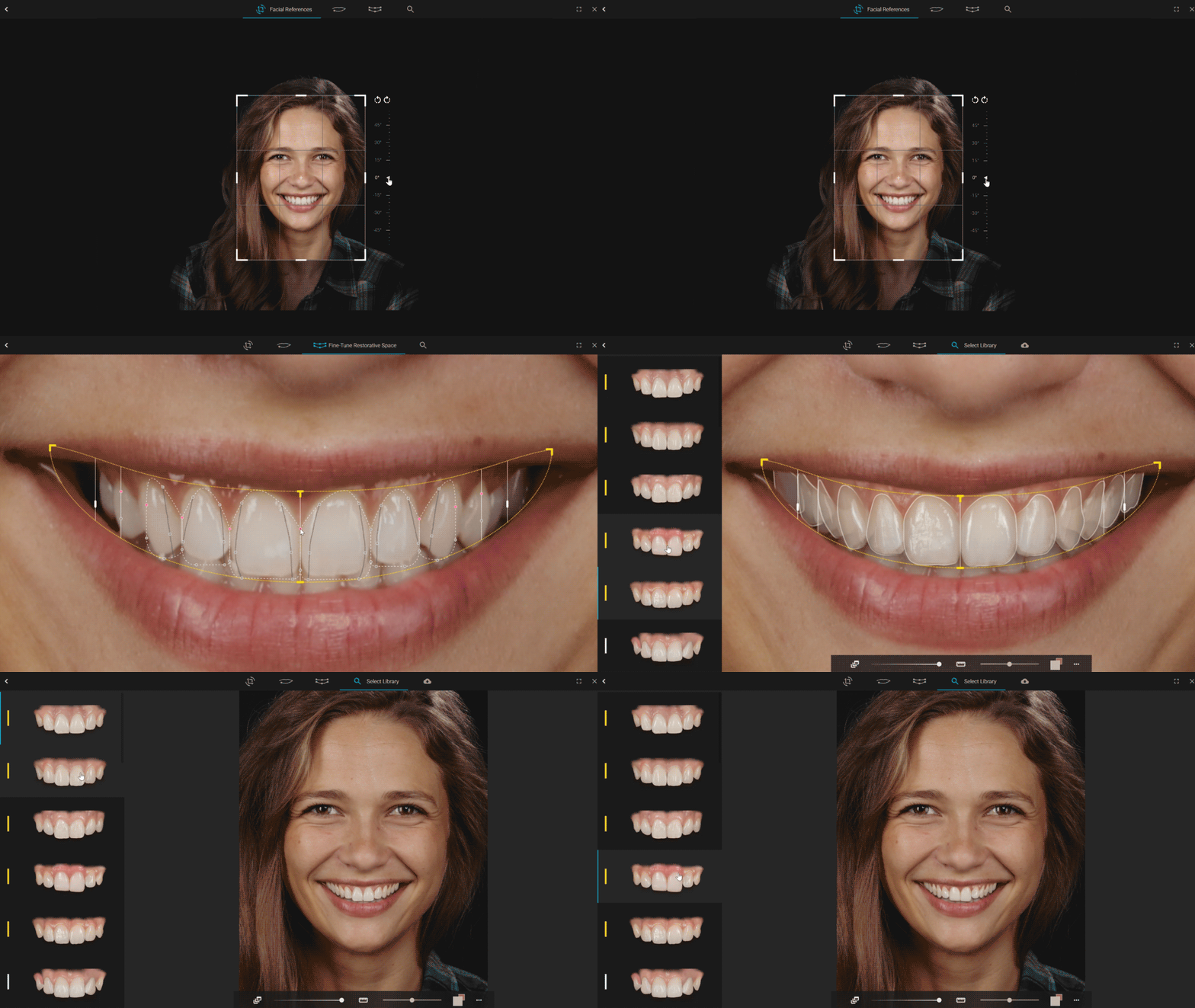
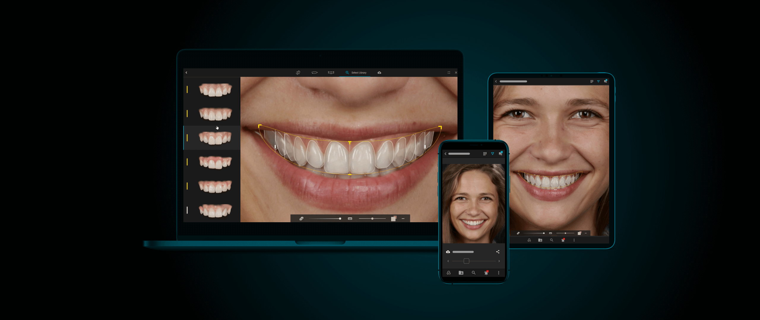
So we did: The face, the alignment, the crop, the lip contour is the boring part that is automatised. You can check or fine-tune. Restorative space is placed based on facial features and aesthetic principles. It is fully editable, has for more customisation options, yet a cleaner UI. Smile design has evolved to a more efficient, yet more creative experience. Facial recognition and AI are used to automate steps in the process, allowing you to get to the core of things in less than 5 clicks. Every extra click feels and is creative. Its decision with real-time impact. You can choose the level of depth you want to invest in the design process, and it is and it feels rewarding.
Lifelike adaptive lighting
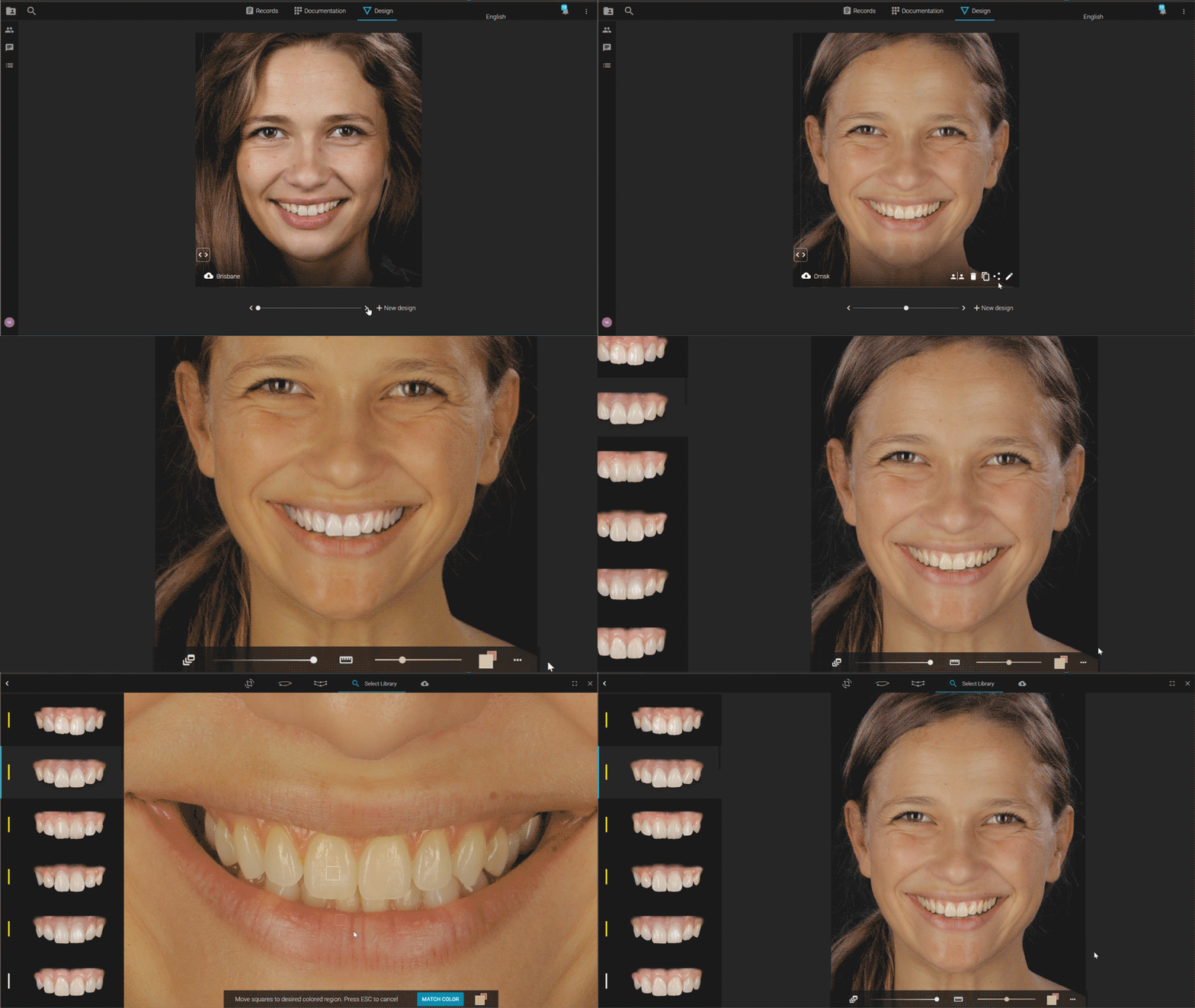
In the same philosophy, we felt color could be improved. We are now mapping the color coordinates in each pixel of both the library and the portrait, and remapping them to match the same light and color conditions. This allows us to render real-time lifelike smiles, on different photography styles. You also have a color picker, that will instantly align color of teeth or gingiva in relation to your choice. As for color of teeth, we made it simple, as it is in nature. There is one slider now, corresponding to smile age.
Younger teeth will have more value , less chroma, and older teeth will have less value and more chroma. Again, less clicks, more juice out of it.
Timeline: Multisync
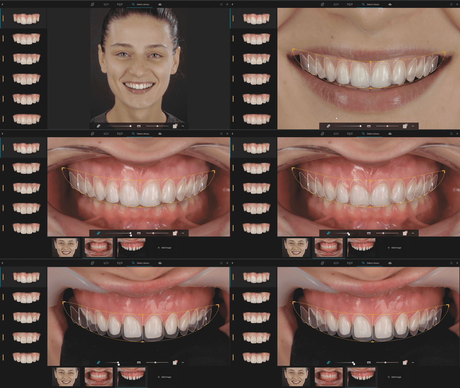
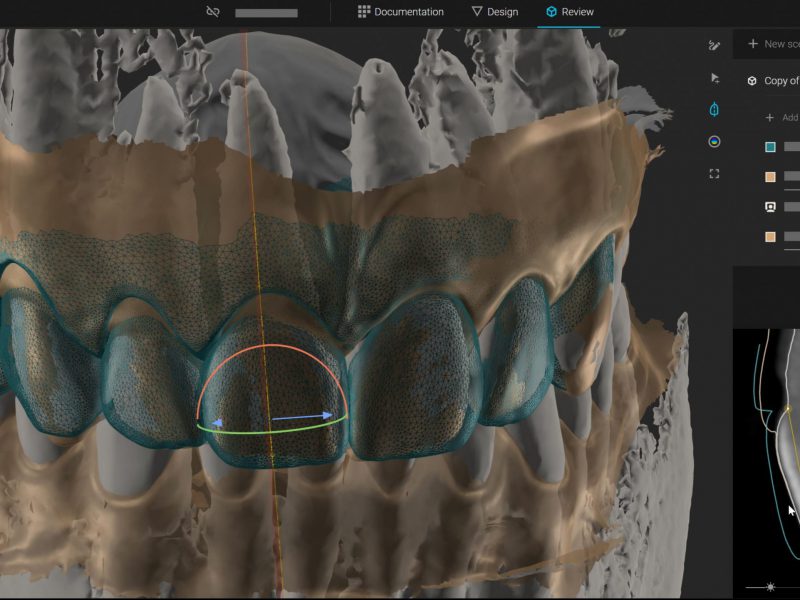
The main narrative of the design process is simplify. So for most scenarios you can go ahead and do everything in a few clicks on a single portrait. However, more depth and options are added via the multi sync feature. It allows you to align more perspectives of the same case in the design process, such as intraoral , or different poses, such as relaxed smile, while designing. And even more exciting, it allows to sync endless other resources on the timeline of the actual treatment, allowing you to follow the case progression, in relation to design.
Desktop apps
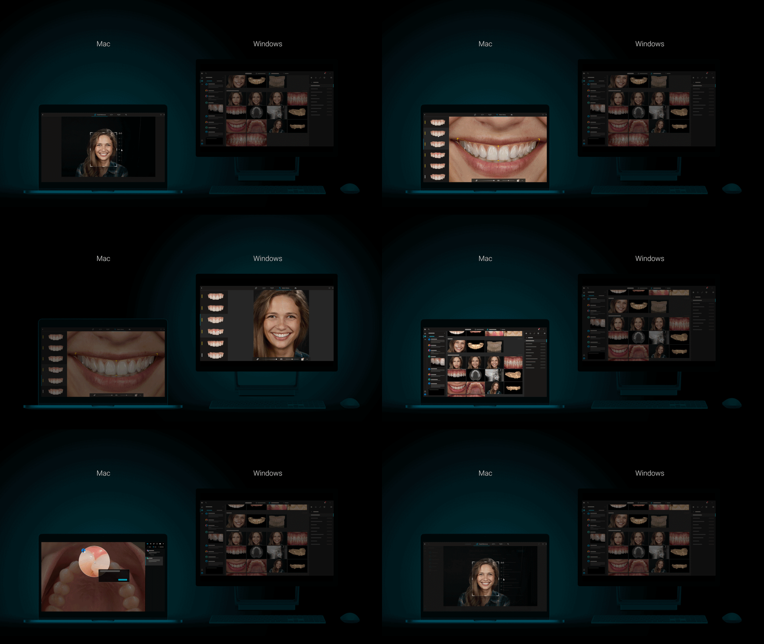
Smilecloud is becoming more and more about your community, and your work environment. As this reality becomes more evident, we are taking steps to making it easier and easier to stay connected, communicate and collaborate. Rubicon is introducing desktop apps for both Windows and Mac. Now you can work seamlessly wherever you are.
More libraries
Last but not least, more natural diversity and more unique designs are coming your way. More libraries have been added, allowing you to search your way to beautiful natural smiles.
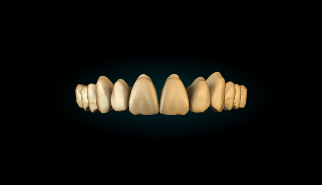
Rubicon 2.0 – Design Tutorial
The new Rubicon is also packed with new shortcuts, so take a look at the tutorial for some tips and tricks and enjoy designing cases.


Steven Fishman
I understand the merits of using this process when the patient’s smile reveals the gingiva above the teeth. However, with patient’s smiles where the crown/gingival junction is not revealed, it appears that we are only selecting on the incisal edge position without consideration for tooth proportion. Am I missing something?
Andreea
Hello Steven, in case the portrait picture doesn’t show the zeniths, you can add intra-oral picture and sync it with the portrait to design in more depth.